
Fledgling
A NEW WAY FOR EMPTY NESTERS
.png)
INTRODUCTION
Empty Nest Syndrome sends ripples of loneliness and loss through households, leaving parents grappling with a void that no text or call can fill.
Fledgling is for people seeking renewed connections beyond digital interactions, aiming for balanced relationships while navigating transitions from caretaker roles to rediscovering fulfilling routines and identities.
TIMELINE
9.2023-12.2023
TOOLS:
Figma, Miro
MY ROLE:
Designer+Researcher
PROBLEM STATEMENT
How might we help parents find a renewed sense of purpose and provide an easier transition for those experiencing Empty Nest Syndrome?
COMPETITIVE ANALYSIS

Nesterly
-
Some individuals’ circumstances may not enable them to participate in home-sharing program
-
Not inclusive of all empty-nesting experiences
-
-
Limited geographical locations
-
Only features listings in Greater Boston, Central Ohio, Greater Lynn, and Louisville
-

My Possible Self
-
Features on the platform are general and don’t specifically focus on empty nest syndrome
-
Purpose building aspects are surface level; they are simply lists for users to build
-
No community aspects. There is only one tool called “People to talk to” that allows users to create a list of people they can trust.

-
Misinformation and disinformation
-
Downvoting
-
Toxic communities
-
Reddit is infamous for hosting a wide variety of users that are afforded the opportunity to spread hateful information and this would not work for the prospective design.
-
INTERVIEWING + AFFINITY DIAGRAMMING
We gathered qualitative data by interviewing 10 members of our target audience.
Some questions included:
Can you describe any specific challenges or difficulties you faced when your children left home, both emotionally and practically?
Have you found any support systems or resources particularly helpful during this transition?
Have you tried any strategies or coping mechanisms to deal with these feelings of loneliness and emptiness?
We then utilized Figjam to start the process of affinity mapping, and we were able to uncover 12 clusters. These clusters revealed themes seen below:

USER PERSONAS
From these themes, we created 3 distinct personas from our primary users, parents from the ages of 40-60, to inform our design process.

.png)

FEATURE IDEATION
Coming up with the features and how they would flow and connect with each other proved to be the most challenging part towards the beginning.
Our initial features we thought of and how they relate to themes we've observed:
Initial onboarding survey to determine interests
Lack of Purpose/Low sense of direction
Daily connection prompts with child
Creating routine + Void
Progress Log
Hobbies+Activities/Creating routine
Initial User Flow

🤔
However, after some discussing, we realized that involving children could potentially hinder the user's growth as it wouldn't be encouraging growth and self identity away from being a parent
🤔
After a lot of late night meetings and going back to the drawing board...

We revised our key features and user flow to make it more focused on the individuals journey:
Initial onboarding survey to determine interests
Daily connection prompts
(self only)
Progress Log
Rewards/Achievements
Community
Lack of Purpose/Low sense of direction
Creating routine + New sense of identity
Hobbies+Activities/Creating routine
Creating routine
Community and new connections
Revised User Flow

WIREFRAMING
After we finalized the key features and user flow, we started to wireframe the screens to get a feel of how we wanted our app to look. Our team translated paper sketches into more structured wireframes, allowing us to define the basic structure and flow of the application.
Some initial wireframes...

.png)
.png)

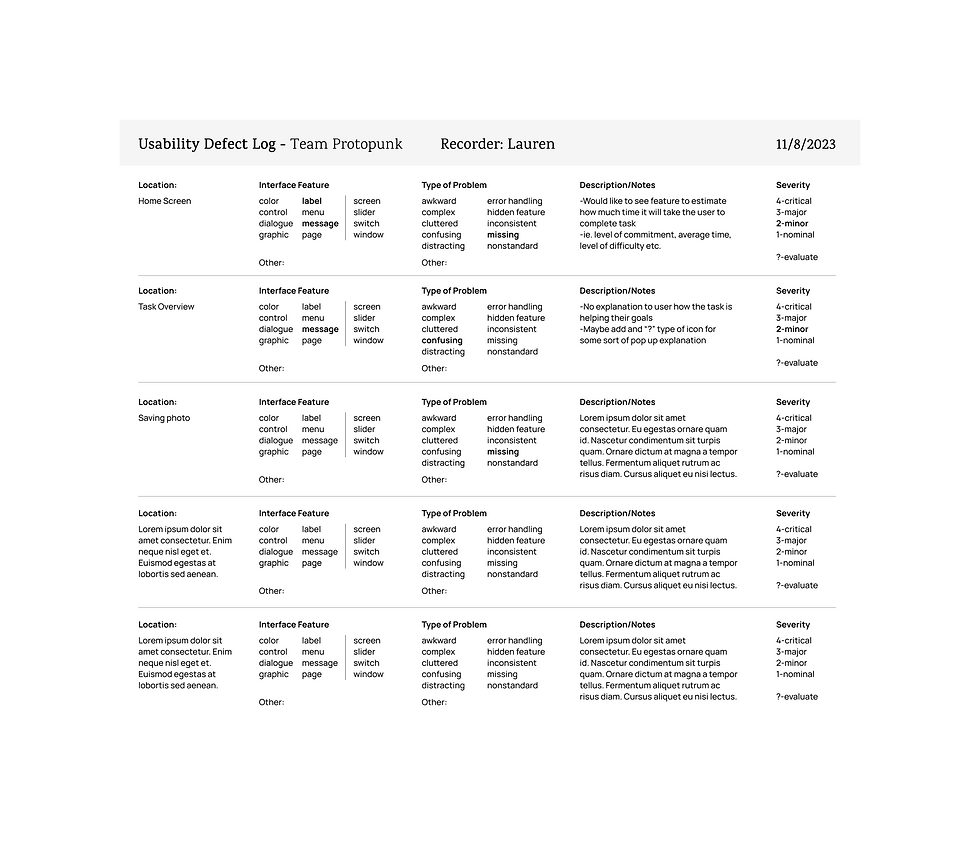
USABILITY TESTING
With our initial designs down, we ask 4 users from our targeted user group to do a usability test to test our current solutions. We then analyzed the data using usability inspection logs.


DESIGN EVOLUTION - CHANGES MADE
Major Changes:
-
Application Changes: After presenting our digital prototype to our peers, it was clear that he low color contrast of our prototype caused confusion differentiating between sections and action items. By enhancing color, font, and icon contrast, we improved accessibility, making the application intuitive and items distinguishable
-
Rewards and Growth: When thinking back to our user evaluations, we found that connecting the daily tasks and reflections back to the user’s original goals were getting lost in our design. To improve the connection between the rewards and the user’s overall progress, we implemented a goal tracking section within the rewards.


FINAL DESIGN CHOICES
.png)

KEY DESIGN FEATURES
.png)
.png)
REFLECTIONS
Our team’s main purpose in creating Fledgeling was to allow parents suffering from empty nest syndrome at any degree to find new sense of identity in purpose in their role as parents.
Many articles and other resources geared towards parents recommend self-help apps that provide therapy or advice, but these resources lacked specificity, community, and purpose building: our main pain points that we discovered in interaction with empty nester parents.
Fledgeling’s unique take on personal healing provides parents with a completely new resource that directly combats empty nest syndrome, instead of relying on apps that provide general information or come at a price point.
Fledgelings can be made new.
Fledgelings can find purpose.
Fledgelings can fill the void in life.
Fledgelings are not alone.
